While offering a seamless user experience to the user by placing the user at the center of the experience is what good UX design is primarily about, a UX designer has yet another uphill task to think about! That of being conscious with the use of certain design techniques and tactics.
Picture this. You are subscribed to a newsletter of a certain company but are considering unsubscribing from it as you feel you are no longer benefitting from the overload of information that you are not particularly keen to consume. While trying to perform this task, you are led to a series of complex steps that redirect you to some other task and make it difficult for you to unsubscribe. Instead of letting you click a simple unsubscribe button or a straightforward link, you go through a frustrating process. What you have encountered is called a dark design pattern, often employed by UX designers to achieve a larger marketing goal.
Essentially, dark patterns are misleading UI/UX decisions taken by UX designers to try to get users to do things they don’t really want to do, in a rather indirect way. They are design elements that deliberately yet subtly push the user in a certain direction — a direction they didn’t really intend to take. Rather than designing with genuine user empathy, dark UX prioritizes a company’s own objectives.
What purpose does dark design intend to serve?
The purpose of dark UX patterns is to work with design principles around human psychology in such a way that they benefit the business at the expense of users. One of the significant challenges that UX designers need to solve is to do a diplomatic balancing act between marketing objectives and users’ needs.
Before we figure out how to avoid dark patterns in UX, let’s delve into understanding a few of the common UX design dark patterns used by designers world over.
Types of UX dark patterns
Bait and Switch

A user sets out to do one thing, but a different, undesirable thing happens instead. For instance, when a user is scouring a particular website for booking flights and is seeing a certain price against a flight on the initial screen but notices a drastic change and increase in prices as he or she lands on the final screen, then they have experienced what is called bait and switch. It is a tactic that is typically used to misdirect the user in such a way that marketing goals take precedence over customer trust.
Forced Continuity
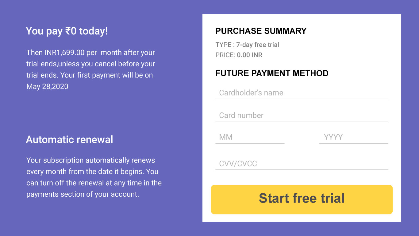
Forced continuity is when designers resort to using design language in a way that necessitates users to share their bank and credit card information by driving them to believe that something is a free trial, only to be later thrown off guard when they realize that their account is being deducted by a recurring fee every month.
Confirmshaming
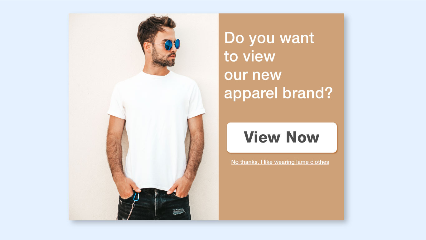
When a website’s pop-up copy aims to manipulate a user and play with the user’s mind, the user has fallen victim to what is called confirmshaming.
Roach Motel
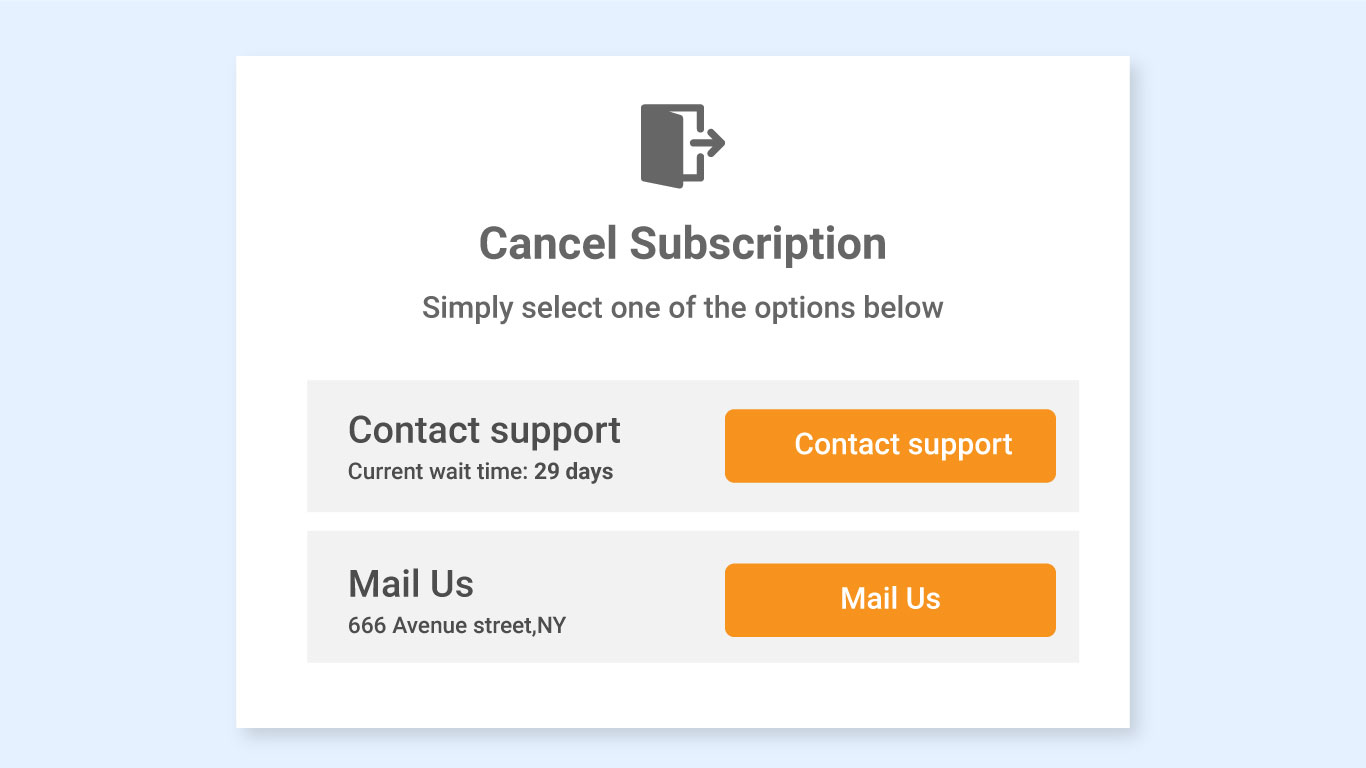
Entering is easy,exit is particularly tricky, i.e., subscription is easy, cancelling is difficult. That’s the idea behind roach motel as a design tactic. Which means, after a user has signed up easily, the user figures that getting out is rather hard. The user is suddenly not given an easy way to cancel the automatic renewal.
Triggering FOMO (Fear of Missing Out)
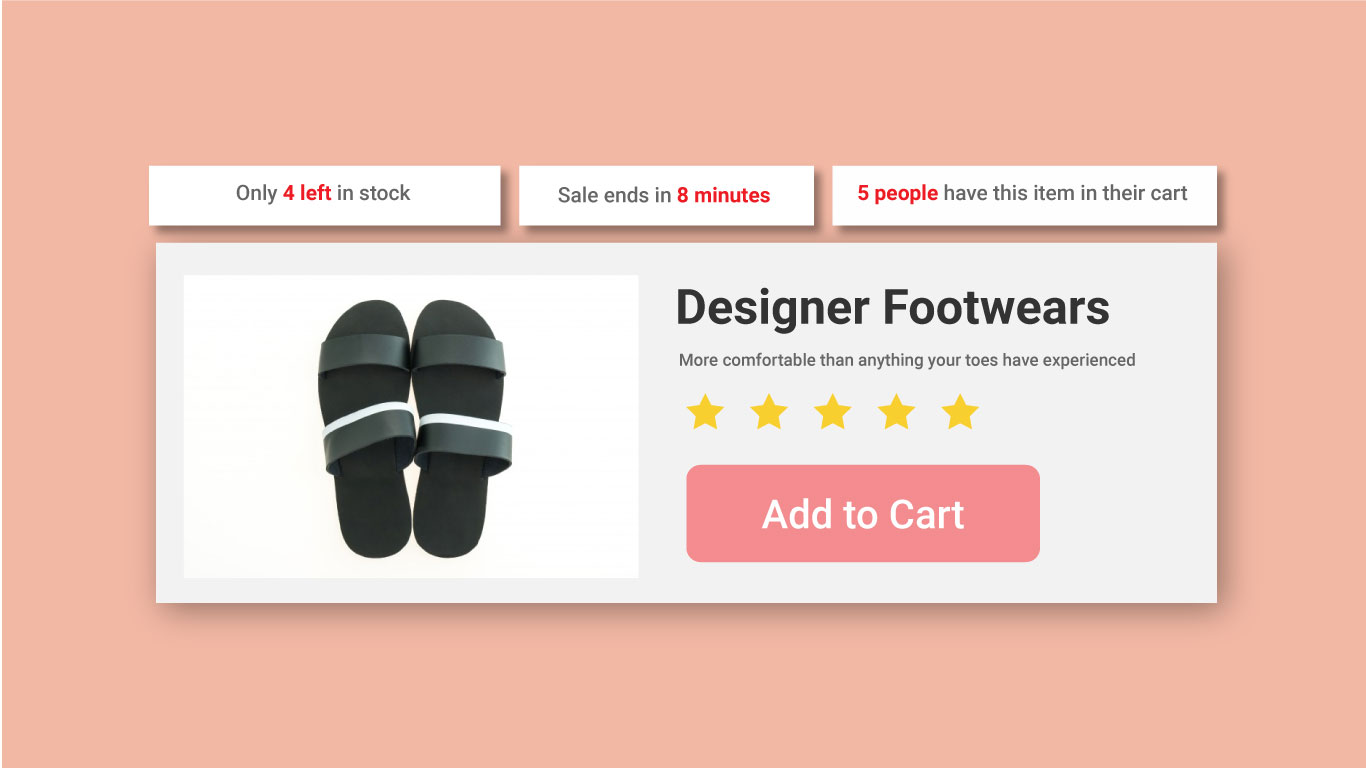
This is particularly found on ecommerce websites where the user is psychologically driven to making a purchase decision with messages such as” Only a few left!” .
What are the implications of dark UX patterns on the user?
Internet users today are aware of the manipulative gimmicks that they can fall prey to. Using dark patterns can cause several implications on the end user and some of them include:
- Violation of user trust
- Friction in user experience
- Compromise on transparency
- A user experience sans empathy
How do you avoid dark patterns in design?
Some design recommendations to avoid dark patterns in design would be to:
- Introduce stringent design practice standards for designers and steer clear of going in that direction.
- Remember to design with empathy and put yourselves in the shoes of their users to offer more human-centric experiences.
- Always put user experience as your end goal over mere numbers and sales goals.
- Take inspiration from the UX designs that follow an ethical design process.
- Conduct extensive user research to get a sense of user expectations.
As a designer, what’s the takeaway?
As a designer, it is our responsibility to educate the general public and business owners about the principles and consequences of design decisions. So it is always better to position good user experience over dark patterns for sustainability of the business. Therefore, being cognizant of how app design plays on human biases is key to avoid falling victim to dark patterns. The most important takeaway is that a great user experience is one in which the designer strikes the right balance of priorities between users, business, and technology.
Author Bio
 Anil is a UX designer at Ionixx and jumps at an opportunity to contribute his learnings in the form of blogs and articles. With a Masters in New Media Design from NID, Ahmedabad in his kitty, Anil’s core strengths lie in new media design, exhibition design, photography, ethnography, iconography, and visual design. While not at work, he loves spending time with family, cycling, playing indoor games, watching movie, and exploring new cuisines.
