As a UX designer, have you ever felt a gap between ideation and wireframing during a design process? Have you struggled to translate users’ perspectives through design decisions? Have you felt the need for a middle path for bridging the gap? Then, storyboarding can be the technique you are looking for.
If you are new to storyboarding, this article can be a good starting point.
What are storyboards?
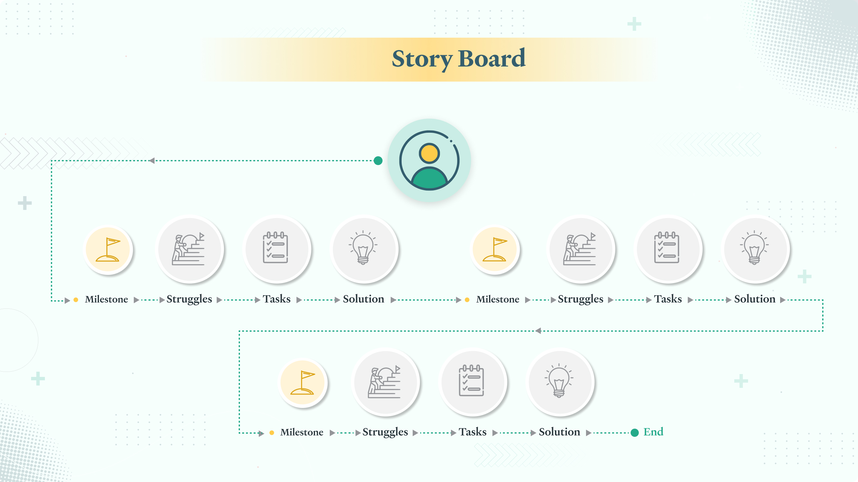
Storyboards are images arranged sequentially to visualize a story. They convert one-liner concepts to detailed narratives.
By that, if you think ‘storyboarding’ is only about fancy panels and aesthetically doodled visuals, you are probably just partially correct. There is much more to a storyboard than what meets the eye. It is much more than a visual representation — it adds distinct value to the product development process.
Storyboards consider and communicate a sequence of events rather than providing a simple visual direction. They demonstrate the possible ways in which end-users might interact with a particular product or service.
Why create storyboards?
Here are a few ways how storyboarding expedites product design.
1. Provides context: Storyboards are easy to understand and reflect on. A storyboard makes it easier to explain the user’s journey to someone outside the design team. A combination of sketches and descriptions effortlessly conveys how your idea can create a better user experience.
2. Works as a powerful storytelling tool: Through storyboards, you can tell a story for everyone to see and relate to. People tend to empathize more with characters who have real-life challenges like their own. A user-centered design puts users at the forefront and helps develop products keeping their pain points in mind. So while making a storyboard, you instinctively gauge the user’s emotions and associate with them.
3. Creates helps working with different user personas: Each user’s wants, needs, and expectations are different from the other. You can connect with all these personas through storyboards and easily identify what works for each of them.
4. Pinpoints errors: UX storyboarding allows you to identify gaps in your thought process. It helps you think in a step-by-step manner and visualize errors, lag of flow, and other difficulties that you may face while designing a product. It also assists in logically ordering the user’s experience and justifying why one design decision is preferable over the other in a particular context.
5. Helps steer clear of cognitive biases: Storyboards keep you away from cognitive biases. During the design process, your brain maneuvers you to concentrate on positive outcomes. This is called optimism bias. For doing a generative task, your brain underestimates the negative attributes of what you are creating, making it impossible for you to realize the shortfalls of the final product. That is where storyboarding plays a vital part. While structuring a storyboard, you have the scope of pausing and analyzing every aspect which might go wrong in the design. Thus, storyboarding allows you to overcome the optimism bias.
6. Fosters collaboration: Storyboarding is a team effort. Not only designers but everybody else from the technical and business teams are welcome to share their inputs in the process. Approaching UX design through storytelling brings teams closer, inspires new ideas, and enables you to have a clearer picture of the end product.
Once mastered well, storyboarding can be quite interesting and engaging. You can start storyboarding once the initial ideation process is complete.
Using storyboards over journey maps How are storyboards different from journey maps?
A journey map is an interpretation of a user’s journey to achieve a goal. It contains various textual or pictorial information, in some cases explaining the key milestones of the journey. In contrast, storyboards are sequential illustrations of a scenario.
Unlike a journey map, a storyboard focuses more on the narratives and the contexts within which different user scenarios emerge. Storyboards allow designers to lay the screens out and thus work out how users can navigate through a particular product. Why would you do it – to spot the gaps and recall the context on a continuous basis.
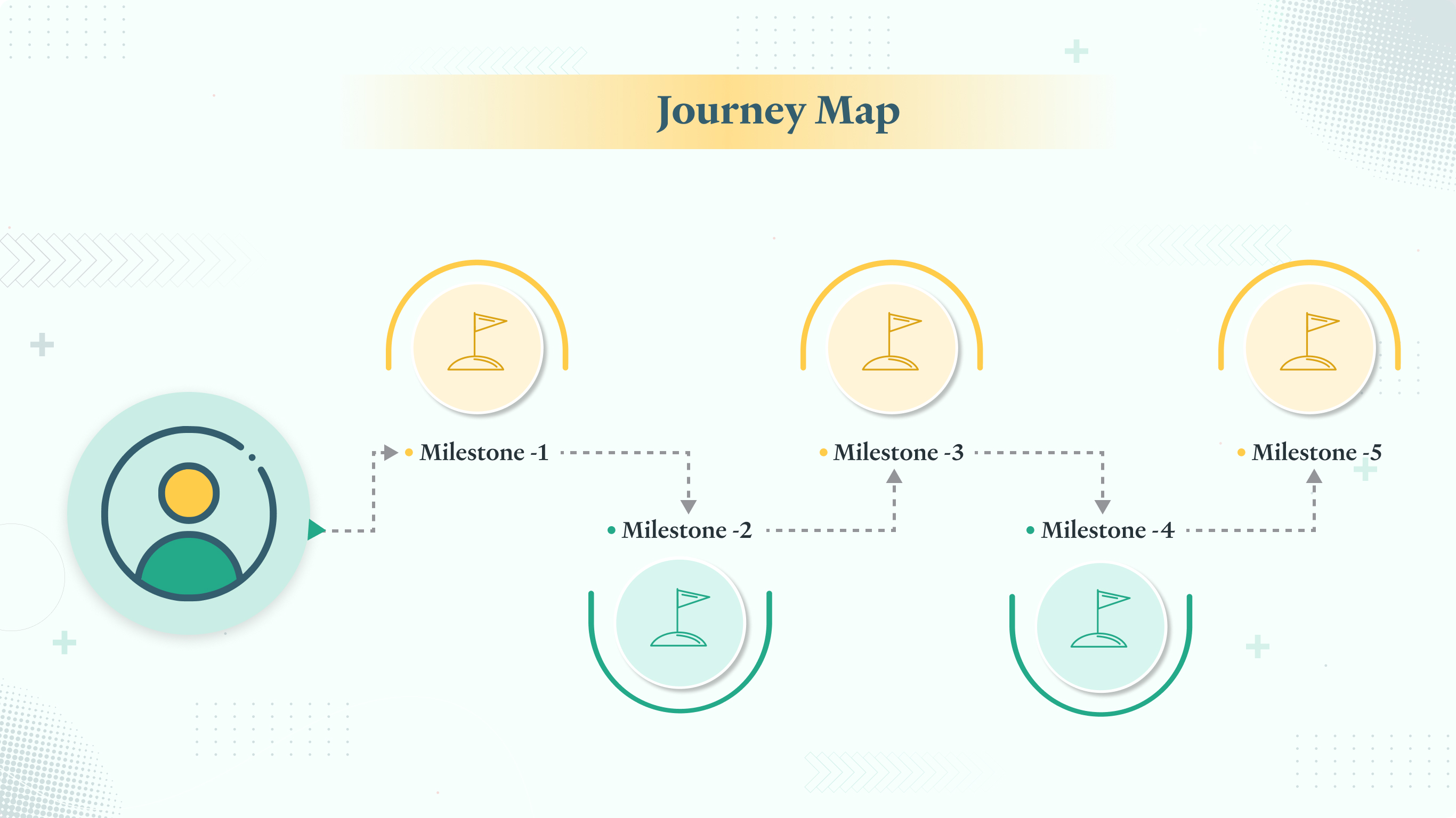
Let’s take the illustration above. Each dot represents a milestone wherein a user initiates or completes a task.
In journey maps, you focus on the milestones only. You try to define the user’s conclusions and gauge their experiences, and based on that, you prepare the wireframes. On the other hand, in a storyboard, you consider the entire context, that is, you focus on the entire path and not the isolated milestones. Without drawing/chalking out a storyboard, we cannot figure out the number of subtasks users must complete to reach a milestone. As a storyboard helps you identify all these subtasks between milestones, it becomes easier to pinpoint possible errors and consider every scenario in your design thinking. Journey maps, on the other hand, are primarily used to design an optimum user experience at each milestone.
Steps to create an effective storyboard
Though it might seem daunting initially, you can create storyboards without much hassle. Here are a few quick steps you can follow:
1. Collect data
Gather supporting data related to your product through user interviews, website metrics, or via usability tests. Real-time data enables you to better understand your target audience.
2. Decide on the fidelity level
Storyboards need not always be too detail-oriented. Low-fidelity prototyping via post-its and hand-sketched layouts are often the fastest and the simplest way of communicating ideas to fellow designers. On the contrary, high-fidelity prototypes and advanced illustrations spark discussions and build consensus among key stakeholders.
3. Outline the basics
Define a persona and the corresponding scenario it represents so that the storyboard doesn’t split. You may have to draw multiple storyboards for complex scenarios, one for each user path.
4. Start with visualization
Before starting with the storyboard, visualize what each frame must include. Write out the steps, join them with arrows, and add icons to signify emotional states.
5. Create relevant visuals and support them with captions
Effective storyboarding is not always about perfect illustrations. What’s more important is that even the most basic sketches are supported by proper captions for explaining the context wherever necessary. Also, modifiable formats help incorporate further iterations.
6. Share and iterate
Share your storyboards with the audience – internally or with even clients. Iterate and improvise if necessary.
Storyboards help you tell stories about the end-users. When supported by actual data and combined with other UX activities, storyboarding diverts the focus from our internal biases and lets you estimate the users’ needs better. It aids stakeholders and clients in remembering specific scenarios and helps understand how a user flow fits into the broader story. If your goal is to envision common usage scenarios and know more about users, storyboarding is just the tool you want.
Author Bio
 Vibisha is a UX Designer at Ionixx. With a major in Psychology, she has had hands-on training from industry experts, to kickstart her design career.
