Color is critical to any successful design project; yet, with project deadlines and high-pressure timelines looming large in the everyday scheme of things, it is easy for designers to fall into a rut and lose touch with the fundamentals.
With our Color workshop, we aimed to rejuvenate the minds of our visual designers by letting them touch base with some of the fundamentals learnt back in school to implement them in real-time scenarios.
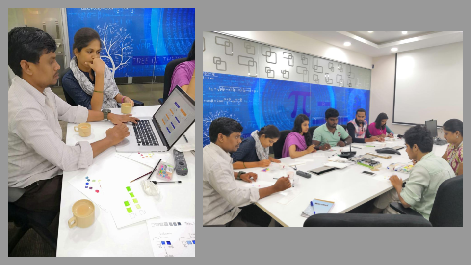
At our Color workshop, VP of Design at Ionixx; guided our visual design team — hands-on, through exciting exercises to help us improve our color sensibilities to nail the ideal color palette for our application development projects. We examined the nuances of color theory in design practice to perfect the art of decision-making with regard to color psychology and behavior.
With this blog, we will quickly walk you through the exercises and give you a bird’s eye view of the whats and whys!
Touching base with analog
Color theory is the science behind understanding what color is, and how it is essential in culture, communication, and everyday life. In design, the wrong colors can cripple your overall efforts, even if all other elements are fitting in perfectly. Here’s what we did to reiterate the basics!
Getting our hands dirty; quite literally!
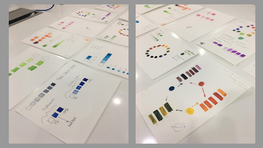
For starters, we got our watercolor kits ready to mix, match, and recall our understanding of the color wheel. Our team got busy trying their hand at mixing the primary colors to derive secondary and tertiary colors. This exercise helped us realize how colors had character and how each color behaved in relation to one another. This also helped the team gain clarity on how choosing a color in real-time design practice is a nuanced process that requires adequate understanding of color fundamentals. Not just that, it also brought immense perspective on how color psychology and behavior added value to the substantiation we make while making a color choice for a certain application’s user interface and its constituent elements.
Incorporating our understanding of color on a digital platform
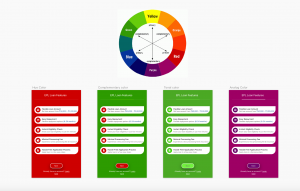
As an extension to our watercolor activity, our visual designers tried applying learnings from it on Adobe Photoshop. With this, we aimed to get an understanding of how to achieve similar results on a digital medium by comparing it with key takeaways gathered from the watercolor exercise. By experimenting with the color palette on the software, we were able to firm up our understanding and distinctly distinguish the meaning of hue from a tone, shade from saturation, a tint from a shade, and so on. With this, we made a resolution to be more conscious, as designers, to use these color-related terms correctly, specifically, and contextually.
Creating a shared understanding of design
Through the maiden workshop at Ionixx, we aimed to achieve a shared understanding of design by emphasizing the relevance of doing such exercises as a team activity. The idea was to make the team come together to spark off more discussions surrounding design and share and gather useful insights. We also wanted to see the value of viewing design practice with a nuanced eye — so we did it in the most fun way possible!
Fostering a design culture
At Ionixx, we believe in fostering a solid design culture that reflects not just in the work we do but also in the way we do it. Through regular workshops, design training sessions, and subject matter lectures, we seek to nurture design talent and nourish a creative as well as productive design dynamic.