In our rapidly advancing digital world, where financial transactions and decisions are increasingly made online, the significance of financial literacy cannot be emphasized enough. As users navigate through various digital platforms for banking, investments & budgeting, the role of UX designers becomes critical in enhancing financial literacy. In this article, we explore key strategies, tools, and techniques for designing user experiences that empower users to make knowledgeable financial decisions. We demonstrate how UX provides an inventive approach to demystify complex financial ideas, making them accessible and comprehensible.
Strategies for Designing a Financially-literate User Experience
1. Designing for Clarity – Clear & Simple-to-navigate Interfaces
The foundational principle in UX design for financial literacy is clarity. Designers should craft interfaces that are intuitive and easy to navigate, ensuring users can access and comprehend their financial information without unnecessary complexity.
Let’s delve into a real-time use case that illustrates how we applied the foundational principle of clarity in UX design for financial literacy.
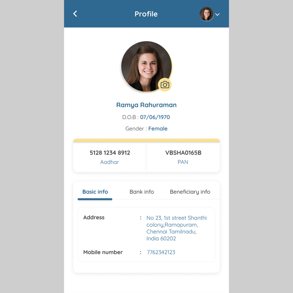
Situation: Enhancing Clarity in Profile Page Design for a Lending App. The existing interface lacked organization, making it challenging for users to locate and understand vital information such as Aadhaar and PAN numbers, as well as basic, bank, and beneficiary details.
Aim: Our goal was to prioritize key information and present it in a clear and intuitive manner.
Approach
1. Clear Hierarchy of Information
We began by establishing a clear hierarchy of information on the profile page, prioritizing Aadhaar and PAN numbers at the top. These crucial identification details were prominently displayed in easily identifiable sections, ensuring users could quickly locate them upon accessing their profile.
2. Streamlined Layout
To enhance clarity and ease of navigation, we adopted a streamlined layout for the profile page. Basic, bank, and beneficiary details were organized into separate sections, each clearly labeled and visually distinct. This approach reduced clutter and made it easier for users to find the specific information they were looking for.
3. Consistent Design Language
We maintained a consistent design language throughout the profile page, employing standardized fonts, colors, and layouts. This consistency helped users navigate the page with ease and minimized cognitive load, enhancing overall clarity and usability.
By prioritizing clarity in the design of the profile page for our P2P lending app, we not only met the needs of our users but also contributed to a more positive and seamless user experience. The principles applied in this case can serve as a guiding framework for designing clarity-focused interfaces in various financial literacy applications.
2. Employing Toolkits – Integration of Educational Modules and Tutorials
Embedding educational components directly into the user experience is a powerful strategy. Interactive tutorials on budgeting and informative pop-ups explaining investment terms serve to enhance users’ understanding of financial concepts. Incorporating this within the platform helps users grasp essential financial knowledge and confidence—from mastering budgeting basics to understanding investment strategies.
3. Visualizing Data – Charts, Graphs, and Infographic Representation
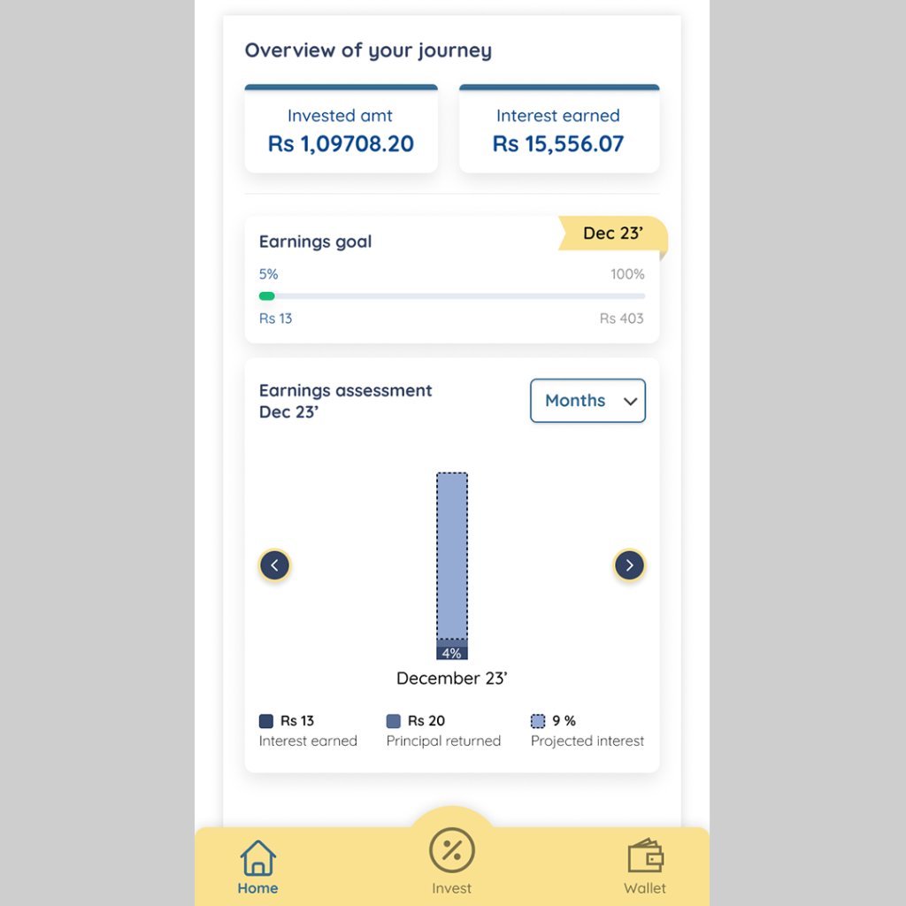
Visualizations, such as charts, graphs, and infographics, serve to simplify complex financial data, allowing designers to present information in a format that users can grasp at a glance. Using visual aids like graphs and charts can simplify complicated financial data. UX designers should make the most of these tools to present information in a visually appealing and easy-to-understand way, helping users quickly understand their financial situation.
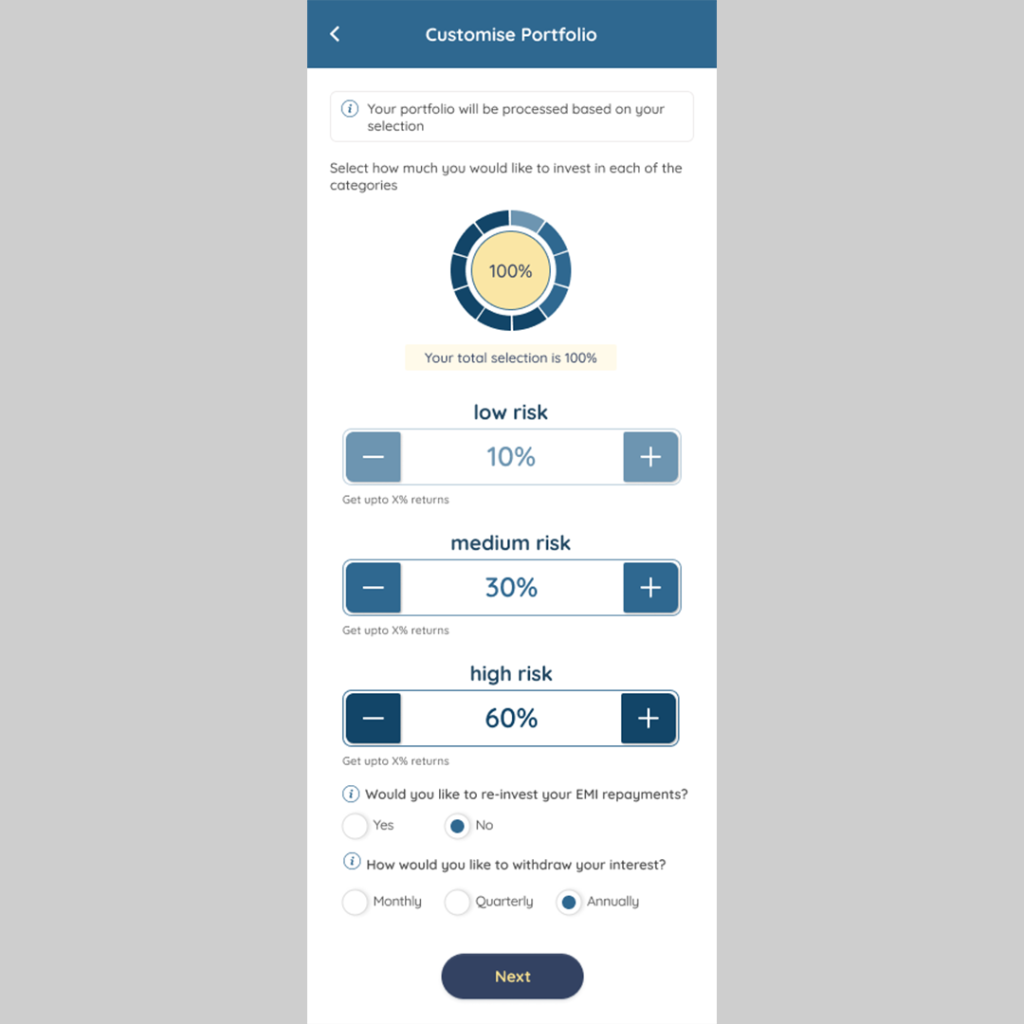
4. Improving Personalization- Individualized Recommendation
Incorporate features that provide personalized financial advice based on user behavior. Whether it’s suggesting savings goals, offering tips for optimizing budgets, or recommending investment diversification, tailoring advice to individual users enhances the relevance and impact of the information.
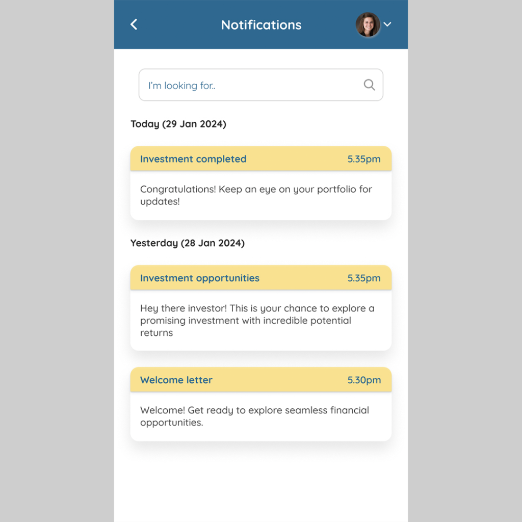
5. Embedding Notifications
Timely notifications can keep users informed about significant transactions, upcoming bills, or potential issues, promoting a heightened awareness of their financial activities.
The Responsibilities of Designers
Ux designers hold a unique responsibility in bridging the gap between users & financial literacy. This responsibility includes:
Building Transparency
Designers must present all relevant financial information transparently. Clearly communicate fees, terms, and conditions, avoiding any hidden or confusing elements. Make sure important details are not concealed in fine print, and use straightforward language to convey information.
Creating a Design That Everyone Can Use
When designing for financial literacy, it’s important to think about all kinds of users. Make sure to include features that help people with different reading levels and physical abilities.
In the realm of financial literacy, designers play a crucial role in ensuring that users comprehend the financial consequences of their actions. This responsibility involves creating user-friendly interfaces, incorporating educational elements, and providing clear information to empower users in making informed financial decisions. Designers must prioritize transparency and accessibility to contribute to a financially literate user base. If you are keen to understand how our UX process factors in your unique business needs and pain points, get in touch with our design studio. We are happy to help.