It was in the final semester when I was pursuing my Bachelor’s degree in psychology that I first heard the phrase, ‘User Experience Design’. Having no prior knowledge about the field, I applied for an internship hoping that I would learn how to use my skills in areas that were traditionally less psychology-oriented. I soon learned I was rather mistaken given that UX design applies a lot of psychology principles to understand what motivates users to behave the way they do.

In this article, that is part of a two-part series, I will explain two prominent UX principles of design; namely designing for self-evidency and designing for efficiency,
Part 1 elaborates what designing for efficiency means against designing for self-evidency.
Part 2 discusses various psychological concepts that can be applied while designing for efficiency and self-evidency.
What constitutes efficient design?
As I began my journey as a UX Designer, one of the first lessons I learned was the importance of designing efficiently. An efficient UX design leads to a positive user experience and adds value to the business. Efficiency is the speed with which a user completes a task after becoming familiar with the user interface. A useful parameter to measure this is the ease with which a user completes a task; it could be through optimal number of clicks, through the use of clear, unambiguous instructions, and so on. Efficiency is an important usability metric that should be at the core of a robust design process.
Why should your design be self-evident?
Imagine you are designing a website with multiple pages. Each page should be self-evident and obvious; a user should be able to gauge how to use it just by looking at it. Sticking to existing design patterns is important but it’s hard to not explore given that as designers, we are always on the lookout for new and novel ways of problem-solving. In case you are tempted to try something novel, ensure that your design is self-explanatory, so the user can grasp how to use it with the necessary instructions.
What is the difference between self-evident and self-explanatory design?
As I learned more about user experience, I came across two interesting design approaches; self-evident and self-explanatory design. A self-evident design is easy to understand, simple, and crystal clear. A good self-evident design eliminates ambiguity and helps the user navigate an interface effortlessly, precluding a steep learning curve. A self-explanatory design has all the information upfront for a user to learn how to use the interface. There is only a small learning curve and a self-explanatory design will reduce the cognitive load for the user.
“Making every page or screen self-evident is like having good lighting in a store: it just makes everything seem better.” – Steve Krug
The first step towards efficient design is to get inside the minds of your target audience.This is where my background in psychology came in handy, a deep understanding of their goals and the ability to empathize with their pain points is necessary for the brainstorming process. I was introduced to tools such as empathy maps, user stories, and prototype testing. Usability heuristics is another important concept that allows you to test the usability of your design. Usability heuristics are a set of guiding principles that can be considered as best practices for ensuring your design is usable. Usability heuristics have their roots in cognitive psychology, social psychology, and social cognition. These tools aid in designing an effective interface that helps users reach their goals with minimal effort and addresses their pain points effectively.
The need for clarity
Clarity plays a huge role in users successfully completing their task. Clarity helps the user know what it is you are helping them achieve. In ‘The Design of Everyday Things’, Don Norman describes the gulf of execution as the “gap between a user’s goal and the means to execute that goal.” When a user sees an interface, they should be able to assess how to meet their goals and what roadblocks they may face. The harder the user finds it to complete their goal, the wider the gulf of execution is. If the user finds the gulf too wide, they may abandon the goal altogether. This is why it is important for design to be self-evident. It is imperative to design with the user’s primary goals as the main focus while also keeping in mind the limitations of the human memory and try to eliminate the several roadblocks they may face on their user journey.
Humans’ short term memory has limited capacity, this means your design should help them capture the most important information in about 15-30 seconds. Draw attention to crucial elements and reduce unnecessary or long text. Communicate a change in status when the user performs an action, such as changing the color of a button when they hover over it.
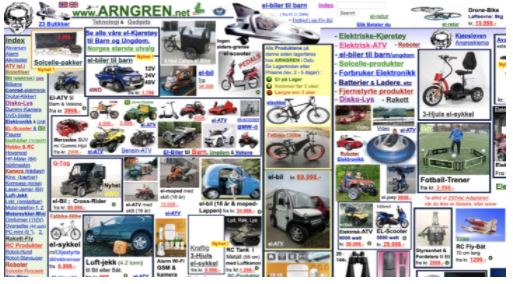
Visual clutter and overcrowding of information not only overwhelms the user but also results in high dropoff rates and poor performance. Adhering to visual hierarchy and categorizing information according to importance helps the user recognize where they should direct most of their attention to. You don’t need to impress the user, instead you should focus on getting them to feel instantly familiar and comfortable with the design.
Bad example: This Norwegian classifieds website is a bad example of design, it has incorrect color usage, poor navigation, tiny and even confusing typography, and lacks visual hierarchy.
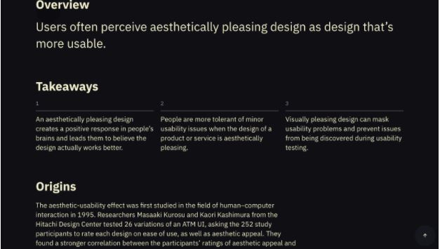
Good example: The laws of ux website has a good visual hierarchy. It breaks down information into smaller chunks and gives varying font sizes according to the importance, letting the user know where they should direct their attention first.
Efficiency and self-evidency should be at the core of your design process. Instead of choosing one over the other, leveraging both to meet your user’s goals will result in a powerful end product which not only helps them complete their goals successfully, but also allows them to get the maximum use out of your product. It utilizes their time and effort in an efficient manner and your users will thank you for it.
Look out for part 2 of this article which will cover topics such as cognitive load and information scent and the role they play in creating a robust design.
Author Bio
 Thendrl is a student of Psychology working as a UX Designer at Ionixx Technologies. She believes psychology and design go hand in hand in creating user-centric products that redefine the future of UX.
